Overview
The what
In this project, we were tasked with redesigning the legendary website Arngren.net in accordance with universal design principles and The Web Content Accessibility Guidelines (WCAG). We were also to use the method of participatory design (PD), involving a participant throughout the entire process.
I focused on visual design and cognitive load, specifically concentrating on how products are displayed on the main page.
The why
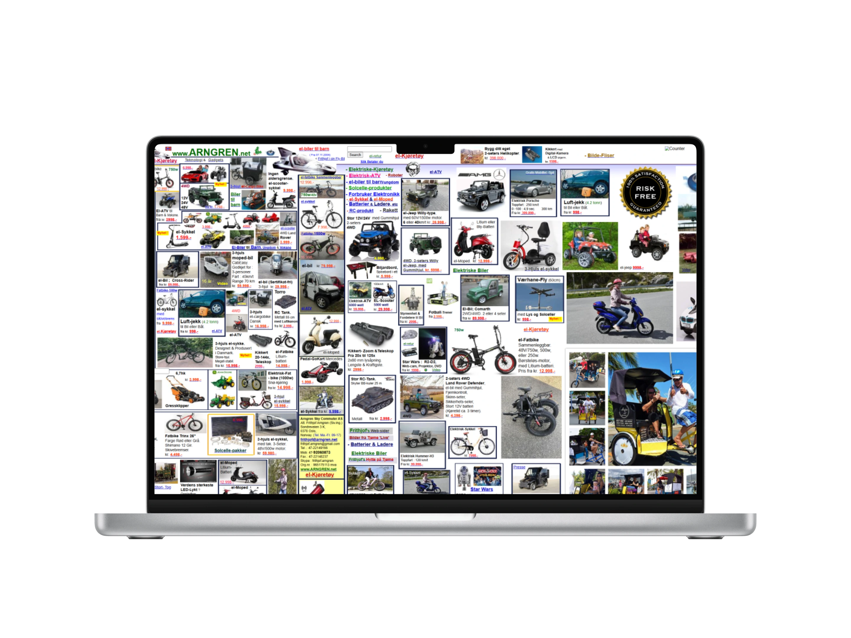
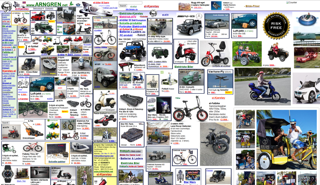
Arngren.net is notorious for its cluttered and overwhelming main page. The chaotic layout significantly increases cognitive load, leading to a frustrating experience as users struggle to process information and locate items on the site.
The disorganized structure diminishes trust, making the site feel unprofessional and unreliable. Insights from user testing confirmed that users struggled to engage, highlighting the need for a more intuitive redesign.
The how
The process was guided by a participatory design (PD) approach, ensuring active user involvement at every stage. It included conducting an initial interview, creating low- and high-fidelity prototypes, and performing two rounds of user testing to refine the design based on feedback.
Universal design principles, WCAG, and design heuristics such as Jakob's Law and the Law of Proximity were integrated to ensure a user-centered and accessible outcome.
Research & Insights
The whole process was guided by a participatory design approach, ensuring the user's active involvement from the beginning. During the research phase, I focused on identifying user pain points to create a solid foundation for the redesign. I chose not to define specific focus areas within universal design principles and WCAG in advance. Instead, I let the participant's experiences and challenges with the website guide the identification of issues.
Semi-structured interview
An initial semi-structured interview was conducted to gather qualitative insights.This format combined a prepared guide with open-ended questions, allowing for flexibility in the interview while ensuring key topics were covered. The approach enabled the participant to share their perspective freely, highlighting specific pain points and areas for improvement.
Insights
The interview revealed several key insights:
- Perception of chaos:The website was described as chaotic and unorganized, with no clear structure or logical grouping of content.
- Cognitive load:The overwhelming amount of elements created significant cognitive strain, making it difficult to navigate or find information.
- Navigation issues:The menu was poorly designed, with too many items and no intuitive grouping, making navigation confusing.
- Trust and usability:The participant found the website visually unappealing and untrustworthy, expressing concerns about the possibility of viruses or scams when interacting with the site.
- User priorities:Clear layouts, consistent design, and visual appeal were highlighted as essential to improving usability and building trust.
Universal Design Principles
Based on the insights from the interview, the redesign focused on improving the display of products to create a more intuitive and user-friendly experience. Universal design principles emphasize simplicity, consistency, and predictability, which were key to addressing the participant's challenges. Regardless of the user's knowledge, experience, or level of concentration, the website should be intuitive, with a design that is easy to understand.
WCAG, particularly the principle of understandability, provided a framework for tackling cognitive overload caused by the chaotic layout and lack of structure. The understandability principle ensures that information and the user interface are presented in ways that users can easily comprehend. This includes making the website readable and using clear, comprehensible language so users can easily understand the content. Furthermore, understandability emphasizes predictability and consistent design. Websites should function in predictable ways, as predictability in the user interface helps users learn and remember how to interact with the content.
Design Ideas
The insights gathered from the research phase served as the foundation for generating design ideas. The primary focus was on addressing the chaotic product display. By aligning with universal design principles and WCAG guidelines, the goal was to create a more intuitive, accessible, and visually appealing experience for users.
Idea 1: Main categories
Organize the landing page into main categories, each represented by an image in a two-column grid. This allows users to navigate directly to product categories while reducing visual clutter. However, displaying only one representative product per category may limit showcasing the full range of offerings, and poorly chosen images could mislead users about the category's content.
Idea 2: Multiple product previews
Group several product images under each category to give users a "sneak peek" of the offerings. This approach reduces clutter while providing a more detailed overview. Examples of categories include "El-bikes," "For Kids," and "Small Electronics." While this format mirrors familiar layouts on other websites, too many categories could still overwhelm users. The ideal number of elements should be tested in usability studies.
Idea 3: Non-traditional product categories
Create a landing page organized by criteria like "Popular Products," "New Arrivals," or "On Sale" rather than categories based on products. This makes the website feel more dynamic and personalized but might make it harder for users to find specific items. It could also help showcase the breadth of products, addressing the participant's feedback that the website appeared to only sell vehicles at first glance. Testing would be necessary to determine the right balance between personalization and usability.
Choosing idea 3: A user-centered decision
All three design ideas aimed to make the landing page more structured and less overwhelming for users. I chose Idea 3 because it organizes the website in a non-traditional way, highlighting particularly relevant products such as "Popular Products," "New Arrivals," or "On Sale." This approach allows the main menu to remain the primary navigation tool for finding specific product types, avoiding duplication of its functionality on the landing page.
Feedback from the participant supported this choice. She typically uses the menu or search bar to find specific items but appreciates browsing bestsellers or deals for inspiration when she has no specific goal. She also preferred familiar layouts and design patterns, which made Idea 3 the most appealing and effective option. Based on this, I developed a paper prototype to explore the concept further.
Design Process
The design process followed an iterative and PD approach, starting with a low-fidelity prototype and progressing through two rounds of user testing—one after the low-fidelity prototype and one after the high-fidelity prototype. The PD approach ensured the user was actively involved throughout the process, providing valuable insights and shaping the design decisions. Feedback from each phase was used to refine the design, ensuring it aligned with user needs and adhered to universal design principles.
Low-fidelity prototype
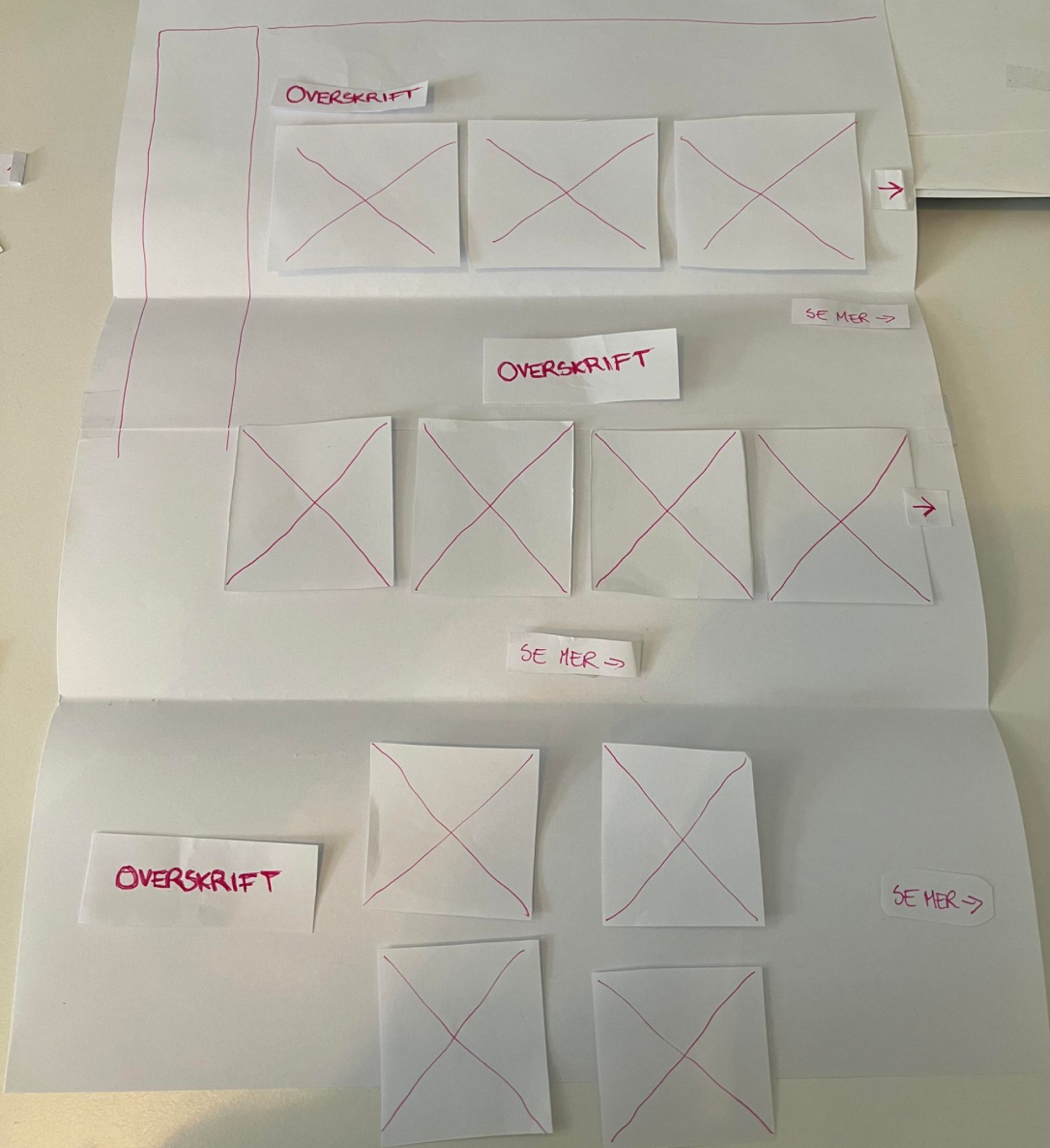
Paper prototypes allow for quick adjustments, exploration of alternative ideas, and early feedback in the process. Unlike digital tools, paper is accessible to everyone, allowing participants to actively contribute without needing special skills. Simple sketches also make it easier for participants to provide feedback, as it's clear the design is not finalized.
Since the prototype focused only on the product area of the landing page, excluding navigation, meaningful user testing required adjustable components. To address this, elements like images, text, and buttons were cut out of paper, with variations such as different image sizes prepared. This allowed the participant to experiment with layouts and alternatives.
To encourage more feedback and interaction, the prototype was intentionally made slightly “messier” by rearranging elements and varying how products were presented in each row. This helped engage the participant more effectively during testing. Specific categories were excluded to keep the focus on structure and organization, while also enabling discussions about appropriate categories and their impact on clarity and usability.
User testing & feedback (1)
For the user testing, I presented the prototype and encouraged the participant to share immediate thoughts on what worked well or poorly. This was followed by a hands-on session, where the participant actively reorganized elements based on what they found most practical and effective. This approach allowed the participant to explore how changes impacted usability. To ensure a structured process, I prepared a user test guide in advance, with key themes, questions, and tasks to address during the session.
Key feedback from user testing:
- Clear visual hierarchy:The participant emphasized the importance of an organized layout, suggesting that consistent spacing and grouping of elements would improve readability and reduce cognitive load.
- Explanatory text:Adding brief explanatory text under product categories was recommended to help users better understand the content and purpose of each section. Especially since the design idea was not to categorize by specific product type.
- Consistent layout:The participant preferred consistent row layouts for product displays, as it mirrored familiar patterns from other websites and made navigation more predictable.
- Clutter reduction:Simplifying the product display by limiting the number of elements on the landing page was seen as critical to improving usability and trust.
- Focus on familiarity: The participant appreciated recognizable design elements and patterns, noting that these enhanced the website's intuitiveness and ease of use.
Revisiting design principles & frameworks
Before developing the high-fidelity prototype, I revisited relevant design principles, frameworks, and best practices to evaluate and anchor the feedback and findings from the user testing. This included aligning the insights with universal design (UU), the Web Content Accessibility Guidelines (WCAG), and heuristics to ensure the design met accessibility and usability standards.
Key design principles such as Jakob's Law and the Law of Proximity were particularly relevant, as they aligned closely with the feedback from user testing. Jakob's Law emphasizes the importance of designing in line with users' expectations, which reduces cognitive load by mirroring familiar layouts and patterns seen on other websites. The Law of Proximity, which states that objects placed near each other are perceived as related, supported the need for clear grouping of elements to enhance readability and organization.
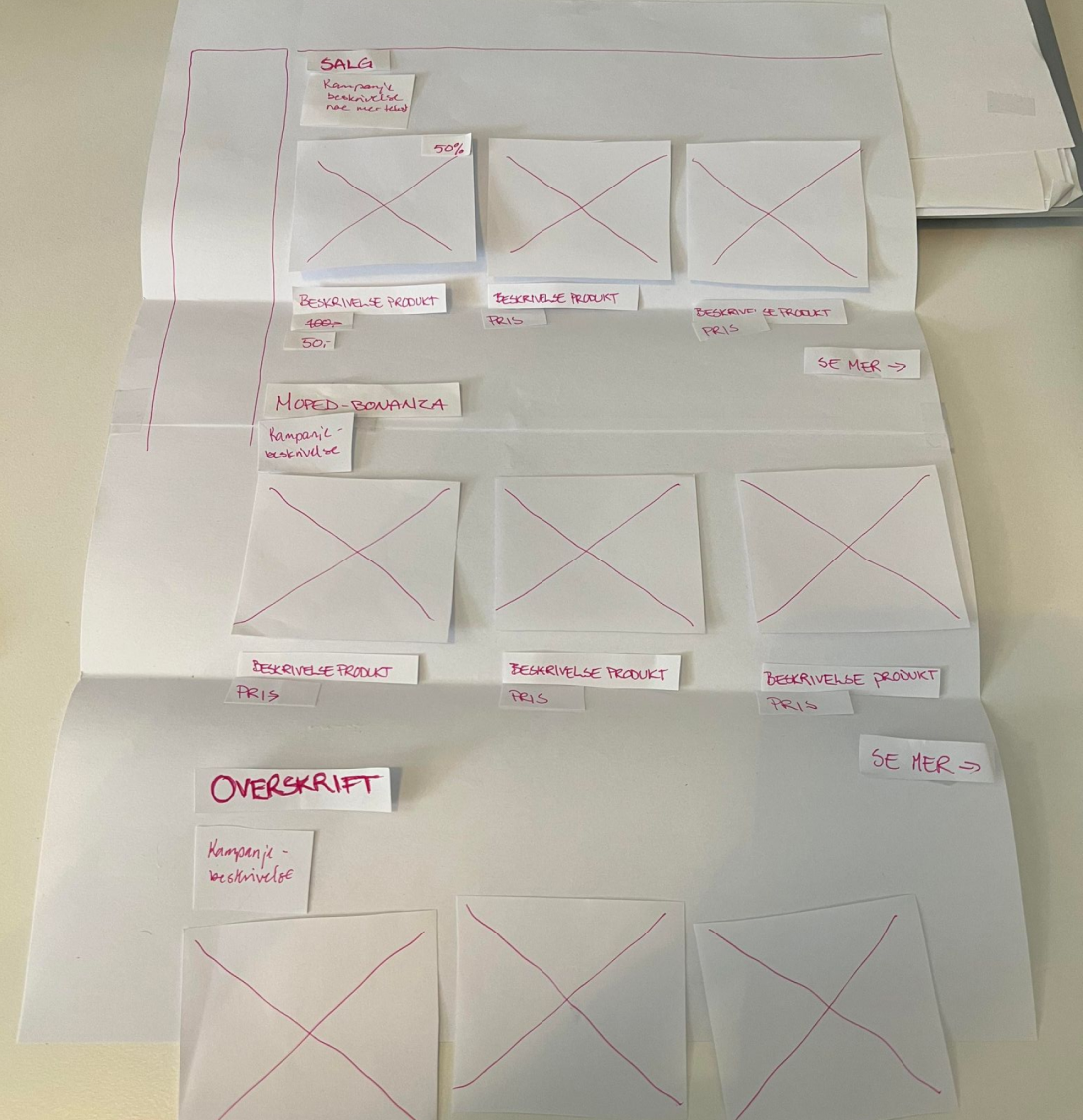
High-fidelity prototype
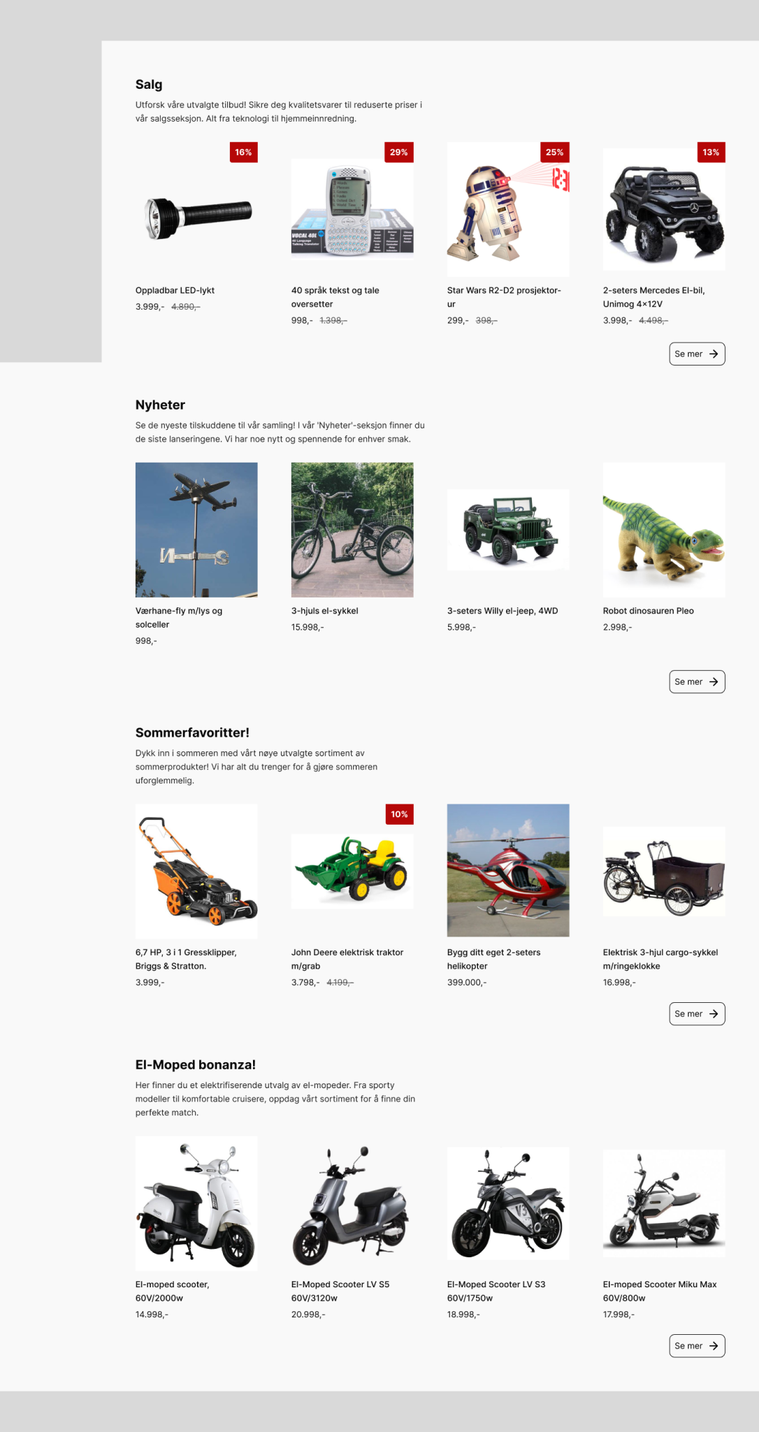
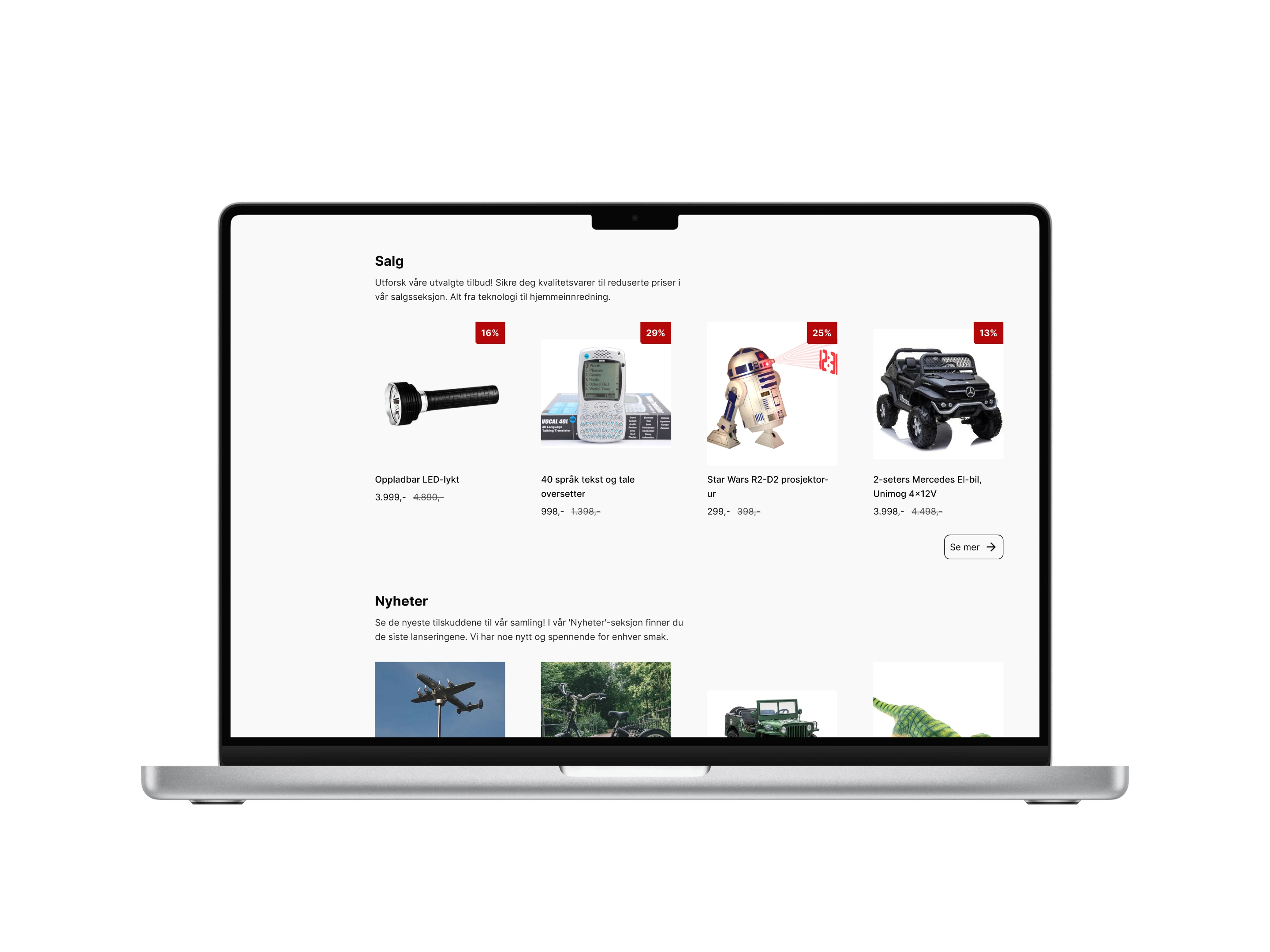
Using insights from user testing and revisiting WCAG, universal design principles, and design guidelines, a high-fidelity prototype was developed in Figma. The prototype featured a more structured product display with three products per row to ensure a consistent and familiar layout. Additional refinements included explanatory text under product categories, consistent whitespace and spacing to clarify groupings, and displaying both the current price and the previous price for added clarity.
User testing & feedback (2)
The second round of user testing focused on evaluating the high-fidelity prototype. The participant gave positive feedback, highlighting the improved organization, consistent layout, and clear categorization, which made the website feel significantly more professional and user-friendly. Because the high-fidelity prototype closely resembled a finished product, it was more challenging for the participant to suggest changes or alternative solutions. Despite this, a few valuable suggestions were made.
Key feedback from user testing:
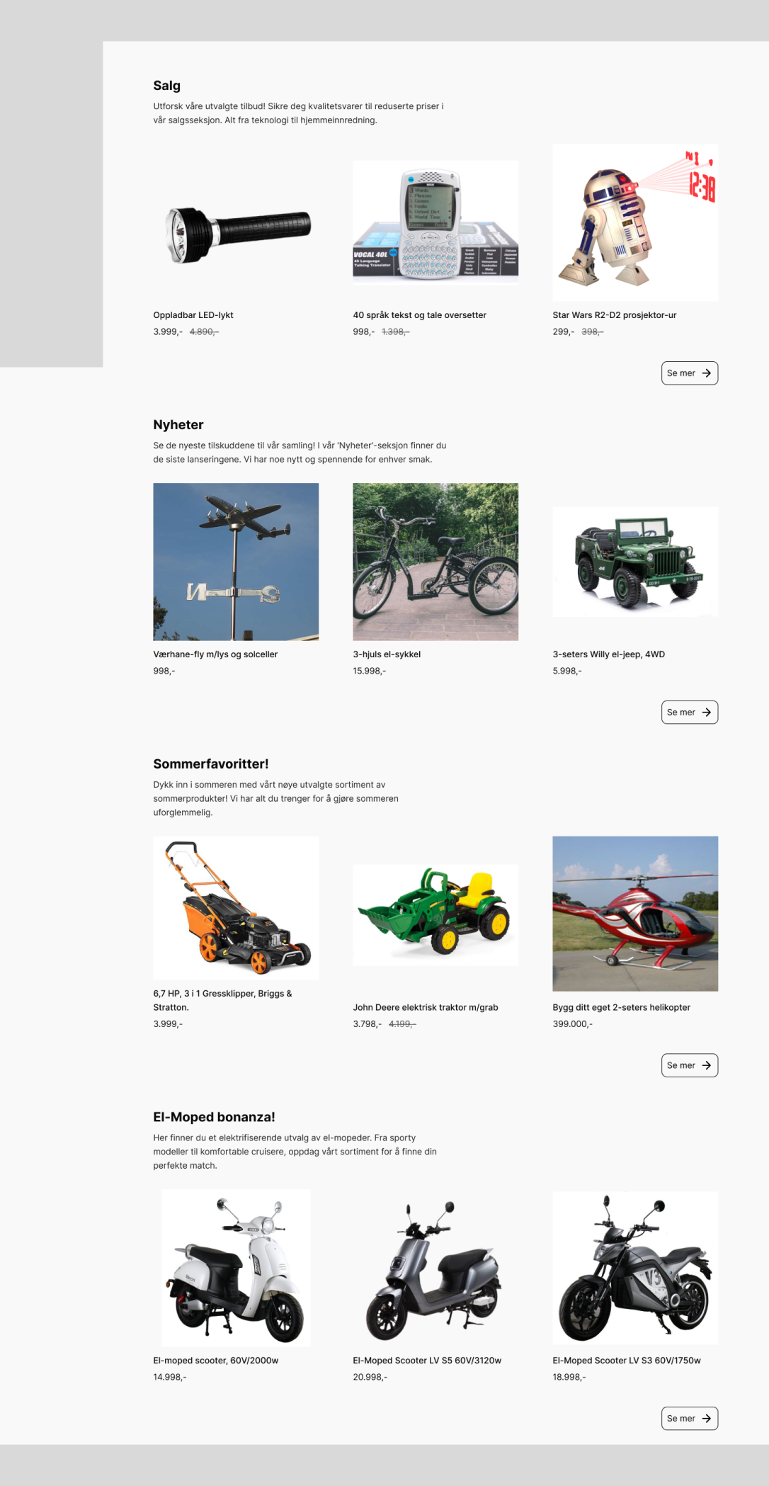
- Layout:The participant suggested displaying four products per row instead of three, as it would make better use of the available screen space. By slightly reducing product sizes, the layout accommodated the extra product without feeling cluttered, which the participant found to be an effective improvement.
- Pricing and sale indicators:The participant appreciated the inclusion of both current and previous prices, noting that it added transparency and clarity. They also suggested adding a more prominent visual marker to highlight products on sale.
The Final Design
The final design addresses the participant's feedback and resolves key usability challenges identified in the research phase. It offers a structured, accessible, and a more visually appealing user experience. By aligning with WCAG guidelines, universal design principles, and best practices such as Jakob's Law and the Law of Proximity, the design ensures accessibility for a diverse range of users while maintaining a predictable and intuitive layout. The solution demonstrates how iterative design and a PD approach, combined with established frameworks, can lead to meaningful and practical results.